Inside reMarkable
How we made reMarkable Paper Pro
Nothing feels more natural than expressing yourself on paper. Our 10-year obsession with digitally recreating that feeling has resulted in a ground-breaking new paper tablet. This is the story of how we closed the gap between ideas and ink.
Pick up a pen. Now start writing.
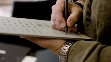
Your brain sends electrical impulses to the small muscles in your hand, initiating fine-motor skills you’ve spent years honing. At the same time, your senses pick up the sight of ink appearing on the page, the sound of the pen tip scratching as it traverses the microscopic peaks and valleys to express a thought.
Now imagine translating those sensory inputs and outputs into millions of ones and zeros for a computer to understand and reproduce, in a fraction of the blink of an eye. That feeling of writing on paper helps you think and focus. It connects your brain to what’s on the page. Without it, reMarkable would be… just another tablet.

But how can a device capture the immediacy and tactility of pen and paper, the inspiration and clarity it provides? And how can it offer something more — giving it digital superpowers without ruining the paper-like experience?
These are the questions that have driven the four-year development of reMarkable Paper Pro by our teams of designers and engineers.
"It’s the biggest undertaking we've ever embarked on. Four years of sheer hard work expressed in a single, beautiful product."
— Mats Herding, Chief Design Officer
A simple idea, a complex challenge
The breakthrough that makes reMarkable Paper Pro possible is also its most prominent feature: the ground-breaking 11.8-inch Canvas Color display. More space to think. A splash of color, and a reading light. It all sounds easy, right?
Although these are the features that our fans have requested since before the launch of reMarkable 2, we had to wait for the technology to finally catch up to our vision.

“We estimate, through our research, that the writing experience has over 20 different dimensions to it, from friction, to sound, to latency. Making sure that when you create technology and add more innovation to that experience without having a detrimental effect on all those aspects is really hard.”
—Magnus Wanberg, founder of reMarkable
Our dedication to delivering the best possible writing experience on a digital device means that we sweat every detail to ensure that despite radical technical and material upgrades, that writing experience will be instantly familiar.
Trying to achieve this gold standard while simultaneously changing or redesigning almost every single element that goes into reproducing this feeling was the hardest part.
“We don’t compromise on writing feel. When we started product development, we didn’t set out to add either color or an improved writing feel. It simply had to be both.”
— Mats Herding
Just add color

Digital paper is perhaps the most analog tech innovation of recent times. It works by millions of ink particles inside the display moving in concert, constantly rearranging themselves, all conducted by the signals from your Marker.
In reMarkable 2, those particles are black and white, swapping places with each other; black for ink, white for paper. To create the new Canvas Color display inside reMarkable Paper Pro, we upgraded to an even more intricate and complex microscopic dance.
Within each pixel in the display, thousands of tiny molecules in four distinct colors held in multiple chambers rise and fall to create the eight native colors for writing. The display does this by mixing white, cyan, magenta, and yellow ink particles.
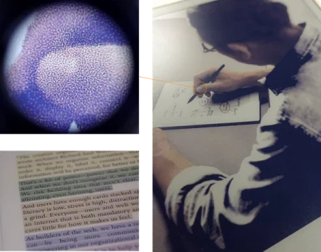
It’s similar to how newspapers are printed, except that it’s happening in real time. And unlike other displays of this type, it means colors have natural depth and saturation. They can be mixed to create thousands of different tones and hues.
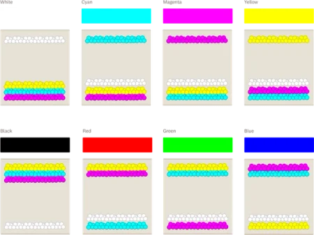
Now, imagine that even after adding the countless new combinations that allow you to read and write in color, we also cut the response time of that ink by 40%. The challenge was making all of this happen without you even noticing.
''Giving people the ability to control how they wanted to use color and express themselves within our note-taking ecosystem was important. To avoid it being distracting or feeling like a gimmick.''
— Mats Herding
A light in the darkness
Beneath the toughened and uniquely textured glass of the writing surface, between an improved touch sensor array and that dynamic color ink layer is another feature that had the potential to spoil the writing experience: a frontlight.
Rather than using an off-the-shelf solution, which would add unwanted thickness to the display (increasing the tip-to-ink distance and affecting how you perceive the accuracy of the tip) we decided to build our own, incredibly thin reading light.
"We wanted to respond to our customer's requests for the ability to read, think, and work in the dark. Still, we had to achieve this without paying any penalty in terms of writing feel."
— Terje Lassen, SVP, engineering
Instead of shining light directly into your eyes, it projects it across the page in front of you, up to a max brightness of 4 nits (about 75 times lower than a laptop). The resulting glow is so subtle that you can work in almost any environment.
And yet, fine-tuning the different levels of illumination was no easy task. In testing, some users wanted a brighter setting for daytime use, others insisted that less was more.
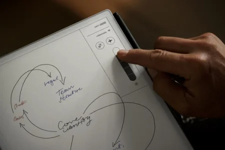
“It’s designed to be used in complete darkness, without distracting others. Imagine a critic taking notes during a movie screening or play in the dark without distracting the person next to them. Or reading in bed, in total darkness, without lighting up the whole room or your face.”
— Terje Lassen
At 150 micrometers, it’s about as gossamer thin as a strand of hair. So that despite this extra layer, the overall distance between pen and ink is now shorter than ever. Something that we hope you’ll be able to actually feel as you’re writing.
Looks can be deceiving
Meeting the demands of the modern workplace and today's knowledge workers presented a different test. Starting with a blank sheet of paper (virtually every part is new) gave us the opportunity for a new, holistic approach to the design of our flagship paper tablet, down to the finest details. By taking control of every aspect, we’ve taken huge strides to improve quality, durability, and repairability for reMarkable Paper Pro.
If you look along the anodized aluminum bezels, at the detail in the corrugated sides, you’ll notice reMarkable Paper Pro is designed to resemble a stack of fresh notebook paper. We think it adds a distinct element that really sets it apart from other tablets: paper, merged with technology. Even with a larger writing surface, the incredibly thin profile shortens the gap between the Marker tip and your desk.
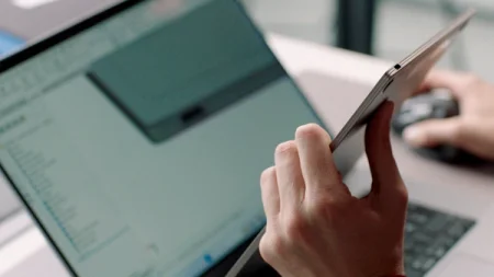
“With reMarkable Paper Pro, we’ve had to completely rethink how we develop hardware. We wanted to take the next step on what product design could be for us. So we have developed this new, beautiful device, telling a story about paper in the actual design.”
— Mats Herding
The new design has real, measurable sustainability benefits that we’re thrilled to be able to talk about. Our current estimate is a 74% increase in the number of components that can be reused under repair compared with reMarkable 2.
Other highlights include the slimmer bezels around the display, a stronger chassis that's easier to access and repair (thanks to a hidden locking mechanism) and more powerful magnets for our brand new range of accessories.
"We hope that the extra effort we put into the design and build of reMarkable Paper Pro is something people can really feel. It should mean your paper tablet is ready for wherever you take it, and should look great on your desk for years"
— Steffi Ramsay, lead mechanical design engineer
Because our tablets are inspired by paper, one of the defining elements of our product design process is trying to pack as much technology as we possibly can into something that looks as familiar and approachable as a notebook and a pen.
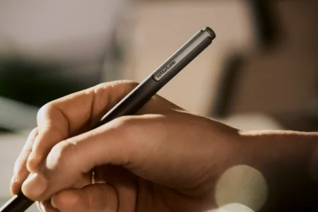
The new Marker is the perfect example. You have something that resembles an everyday item you’ve used thousands of times. But it contains about 250 parts hidden inside, all in a sleek profile that's just as simple to use as the real thing.
The foundation for a software revolution
Of course, pioneering hardware is nothing without a software experience that ties it all together. Our custom-built, Linux-based operating system, reMarkable OS has been given a thorough visual refresh and tune-up for the new tablet.
There’s a fresh writing tool designed specifically with our new color palette in mind: the shader. With a push of the refine key on the Type Folio’s keyboard, the Marker becomes a magic wand that lets you smoothly edit and rearrange paragraphs and sentences of type with a pen stroke — keeping you in the zone while typing.
These features are combined with meaningful security, sync, and performance upgrades. However, we hope that with much faster silicon in place, the best is still to come.

“We really pride ourselves on just how much customer value we’ve delivered within our software experience and app ecosystem since the launch of reMarkable 2 in 2020.”
— Camila Sanhueza Holven
It was impossible to imagine in 2020 that reMarkable 2 would be capable of supporting both handwriting and typed text, streaming live content to our desktop app, organizing notes and PDFs with tags, or select handwriting conversion.
The leaps in technology that have occurred on the inside of reMarkable Paper Pro should future proof it for years. Raising the tantalizing possibility of a new wave of exciting note-taking experiences on our paper tablets and in the apps.

Over to you
reMarkable Paper Pro is the culmination of countless hours of work by talented people dedicated to making something that we could be truly proud of and that we hope will change the way people work and think on digital paper.
Whether you first experience it in a store, through friends or colleagues, or by buying one for yourself, we hope our passion and dedication will come across.
Throughout the challenges, progress, and pitfalls of its development, nothing has excited us more than the prospect of seeing what our customers will create with reMarkable Paper Pro. We’ve made an incredible new notebook, it’s up to you to fill its pages.
Learn more about reMarkable Paper Pro.
