Inside reMarkable
Inside reMarkable 2 — chapter 3: the hardware
This is the third chapter in our Inside reMarkable 2 series, documenting the creation of reMarkable 2, the world’s thinnest tablet.

Between the sheets
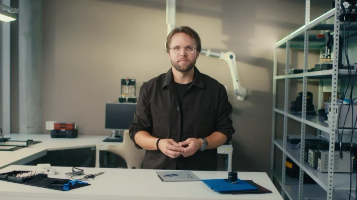
During the development of reMarkable 2, chief design officer Mats Herding kept a very interesting spreadsheet. In it, Herding documented the thinness of every component slated for the device in millimeters, down to four decimal places.
“Just a flex cable for example,” he says. “We had to know it would be 0.6745 millimeters thin.”
“Once we had a rough list of all the components, we had to go through and start seeing where we could make things thinner.”
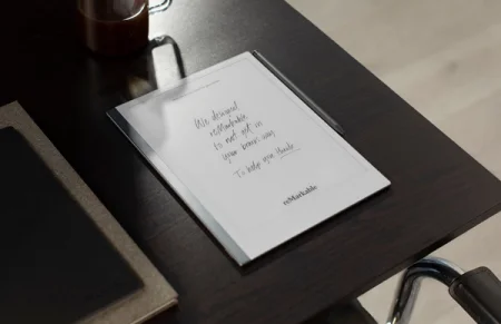
A thinner device was important for a number of reasons. A thinner paper tablet can easily fit in your bag, and it’s more comfortable to write on given the reduction in distance between the edge of the screen and where you rest your arm. The thinner they could make reMarkable 2, the more like paper it would be.
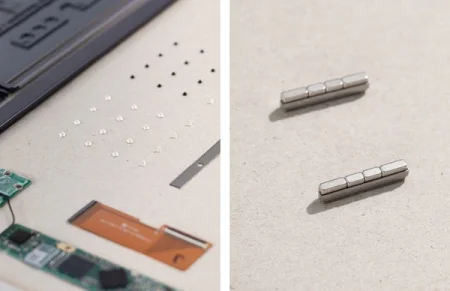
The problem, as Herding explains, was that they couldn’t just stack a bunch of thin components atop one another and make a paper-thin device — they needed to rethink the shape, placement, and material of each one. To complicate matters, there were hundreds of components to consider.
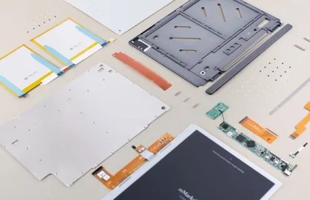
The ‘eureka moment’ occurred when the team realized they could treat the screen as a separate entity to the other components. They found out rearranging the processor and mainboard to fit in a bezel along the bottom edge of the tablet, on the same layer, led to a much slimmer design.
The idea is similar to taking the cards from your wallet and spreading them out on the table, the result is much thinner. For it to work though, they needed to somehow create a battery that would not only fit the design, but provide exceptional battery life.
“Batteries are quite shapeable. So I was thinking… we could have a battery that is huge… just super thin!” says Herding.
“So we kept the PCB (main board) on the outside, and put this really thin battery under the screen.”
“We ended up getting a battery that is 1.4 mm thin, and it lasts for two weeks, or ninety days on standby. That’s pretty incredible when you think about it.”
Under the microscope
It may seem like Herding is obsessed with thinness, but it’s only one aspect of reMarkable 2’s design, among many others. Getting the surface friction right, for example, has been one of the biggest challenges in the next-gen device’s development.
“This time around we wanted to go further, and understand more, about the physics involved when it comes to the writing experience. So we’ve spent two years growing our understanding of what constitutes the perfect handwriting experience from a physical perspective.”
“The complexity of that is just immense. It’s just bottomless. How do you describe a good writing experience? What words do you use that we can actually use as a reference, and how do we measure it objectively?”
Developing the understanding Herding is talking about, involved a range of things, from talking with reMarkable users and everyday people who like to write by hand, to looking at the components and materials in great detail.
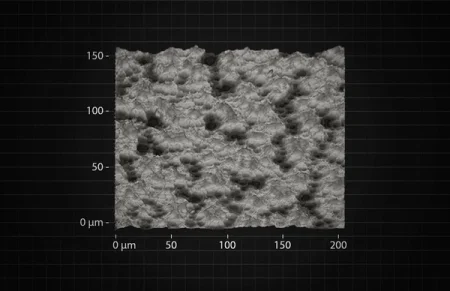
“We do a lot of scans on a microscopic level, of all the materials we use,” Herding says.
“Not only micro level 2d scans, but 3d scans of all the surfaces, so we can understand the topography and how it leads to certain feedback when you write.”
“We look at it like microscopic landscapes. You have alps, or you have rolling hills, and you have the highest peaks and the lowest valleys. How these landscapes interact with the Marker tip material determines the friction and writing experience you get.”
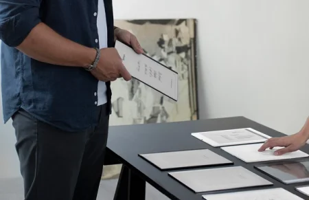
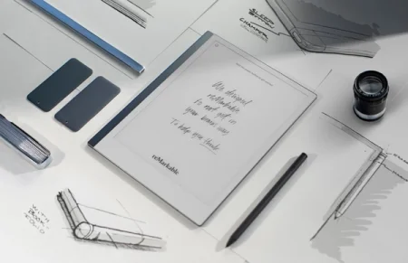
In many ways, the reMarkable 2 hardware owes a lot to reMarkable 1. As Herding explains, when they set out to make reMarkable 1 they had so many different ideas that not all of them made it into the final design. After time to reflect, reMarkable 2 was a chance to incorporate a lot of the more ambitious things they couldn’t include the first time around. One example is a Folio cover that opens and closes like a book, so you can protect your device while you’re working.
One of Herding’s pet peeves has always been products that were not designed to fit with their accessories, and vice versa. So when the time came, the team was really focused on solving the reMarkable 2 accessories in a seamless, and symbiotic way. In light of that goal, Marker, Marker Plus, and the Folios were all planned and designed together, alongside the main hardware.
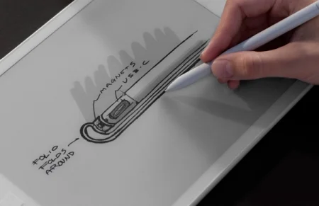
“One thing that was difficult to solve was magnets,” says Herding, referring to the way the accessories magnetically snap in place.
“There’s a sensor in the Marker that tells it to draw when it’s in range of a small magnetic field induced by the device. That makes putting any magnets inside the device super, super difficult because they can prevent the Marker from working in certain areas. Also, because the device is so thin, getting the small magnets to work effectively has been an interesting challenge.”
The key to making it work was a combination of magnets with specific arrays, that are strong in one orientation and weak in another, and sophisticated shielding materials that direct and control the strength of the magnets. The Folios also had their own challenges, given they needed to be so thin.
“When you spend so much time and energy on making a thin product, you don’t want to add a thick Folio to it. Then you’re losing the whole battle,” says Herding.
“So we did a great deal of experimenting and testing to find the right strength and thinness. The Folios needed to be sturdy enough to protect your reMarkable, but not so thick that they would ruin its profile.”
Despite all the hard work that has gone into the Folios, Herding still hopes there will be occasions for people to use reMarkable 2 without one.
“I really hope people use the product naked,” he says.
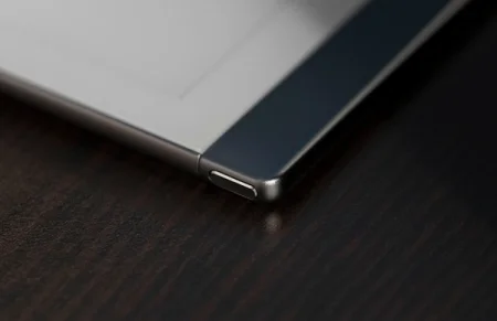
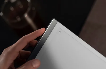
“The side bezel gives you something to hold and the aluminum is so nice to touch.”
Got your back
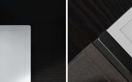
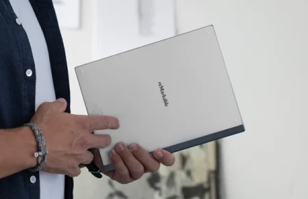
In contrast to reMarkable 1, flipping reMarkable 2 over and looking at its back cover results in a view of the exact same color. Both sides even feel the same. According to Herding this is for good reason.
“We wanted you to only be touching paper when you pick it up. The whole device should feel similar, wherever you touch it, like paper does,” he says.
“And that’s also why we wanted to mirror the color on the front and back. So it is more like a stack of paper that’s been dipped in aluminum.”
Herding explains they also used more aluminum in the design of reMarkable 2 in a conscious effort to lift the premium feel of the device. The spine and the edges that run around the rest of reMarkable 2, give it a distinct quality feel. Yet it’s a departure from the typical tablet design, which features even bezels (borders) on every side.
“We thought it was a bold move, to do an asymmetric tablet design with that notebook look. It’s definitely very a-typical for a mobile device.”
“But we did so many tests on it, and the end result is something our team has ended up loving. It’s definitely something you have to work with, and get used to, but I have a feeling people are really going to like it.”
It’s the little things
From the millimeter precision in his spreadsheet, to the analysis of micro level material scans, Herding values attention to detail.
The aspects of reMarkable 2 he gets most excited about are the ones you don’t notice at first.
The cool feeling of uninterrupted aluminum and the smooth CANVAS display, the nice texture when you hold the Marker, or just the way a magnet snaps in place perfectly.
“I love products that have surprises in them. Things you experience over time. Not the first time you meet the product,” he says.
“It’s that old cliche about albums. The good ones get better the tenth time you hear them.”
